2019 VSS DNA

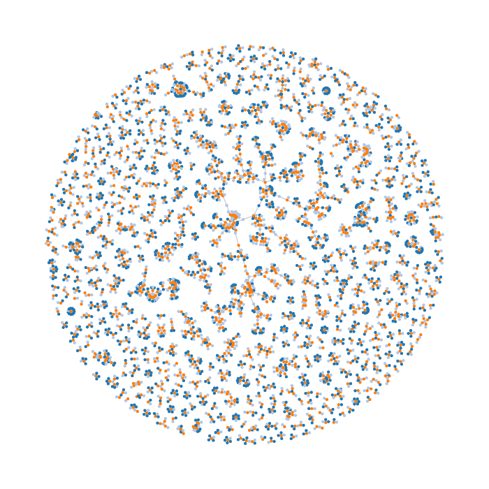
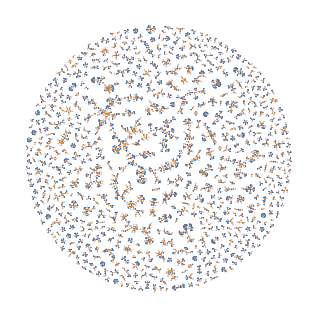
It’s been a while since I last posted one, but here’s a new Vision Sciences Society force-directed diagram of co-authorships (see past graphs here: 2014, 2015, & 2016). This year has 1293 abstracts for analysis. The graph was generated in Python using NetworkX, with authors and abstracts as nodes and edges corresponding to authorship. Individuals who are authors on more than one abstract will have edges connecting to those abstracts.

Orange dots are abstracts, light blue dots correspond to individuals who are first authors on an abstract, and dark blue dots correspond to the other author(s). You can view an interactive version here.

2015 VSS DNA

Another year, another Vision Sciences Society force-directed diagram of co-authorships (see last year’s 2014 VSS DNA). This year, we have 1419 abstracts being analyzed. The graph was generated in Python using NetworkX, with authors and abstracts as nodes and edges corresponding to authorship. Individuals who are authors on more than one abstract will have edges connecting to those abstracts.

Illustrating co-authorship for the Vision Sciences Society abstracts

Orange dots are abstracts, light blue dots correspond to individuals who are first authors, and dark blue dots correspond to the other author(s). This visualisation should not to be interpreted as sets of in-groups/out-groups. It ignores past/future VSS co-authorships, casual collaborations, professional collaborations outside of VSS, and likely has inaccuracies due to the way authors’ names are analysed (see after the break for more). I am intrigued by the “scholarly social network” and this visualization is just one piece of a very incomplete puzzle.

Read More

Calories as a function of alcohol in popular beers

In the USA, a standard drink is defined as including 0.6 fluid ounce (18 mL or 14 g) of ethanol (see Alcohol equivalence), meaning that a “standard” 12 oz beer has about 5% ABV. However, beers vary quite a bit in their alcohol content as well as their caloric content, so it seems reasonable to ask: If I have a beer with a given ABV, approximately how many calories does it have?

While browsing the web, I found a table listing the calories in a number of beers and thought it would be interesting to visualize using Python and plot.ly. It is a simple visualization, but one I find neat. Without further adieu:

Each blue point on the plot is a beer from the beer100.com domestic and international tables — feel free to explore the plot with your mouse. As you can see, unsurprisingly, as a beer’s alcohol content increases, so do the number of calories. Fitting a linear regression to the data, we see that a linear trend fits quite well: f(x) = (28.2)*x + (8.25), where x is the beer’s ABV (in percent). This means that if a beer has an alcoholic content of 5%, we can expect it to have approximately 150 calories (149.25 as predicted by the fit). However, there is quite a bit of variability between different beers of the same ABV. For example, Bud Ice Light and Kronenbourg Imported Dark Beer (whose label is a bit ambiguous, but I am assuming may be Kronenbourg 1664 Brune) are both 5% ABV, but have 115 and 163 calories per 12 oz, respectively.

Read More

2 Degrees of Academic Separation using Google Scholar v1

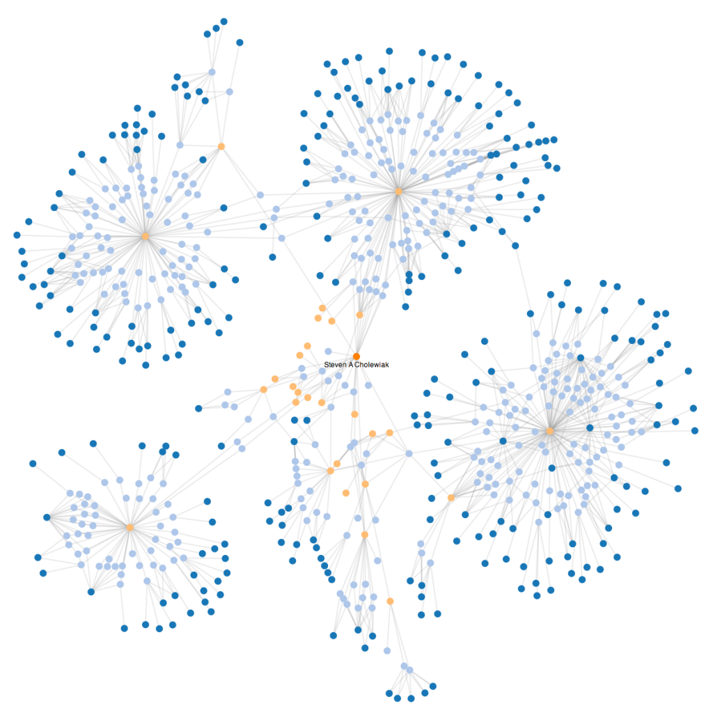
Another post, another neat force-directed graph. This one illustrates the interconnections between professors and students who have been co-authors on some of my papers and presentations, as scrapped from Google Scholar citations.  It could be described as the first version of a rough illustration of my 2 degrees of separation in academia.

2-Degrees-of-Academic-Seperation-v1.1

The dark orange circle in the center is myself, light blue circles are papers/presentations, light orange circles are co-authors, and dark-blue circles are co-authors of my co-authors (i.e., have not necessarily directly worked with me on a project).

Unfortunately, as of today, not all of my co-authors have Google Scholar pages, so there are a number of co-authors whose connections and branches are under-represented.  In addition, Google Scholar does not necessarily accumulate all of a given author’s papers/presentations and often makes mistakes misattributing papers to profiles.  So, the veracity of the information represented here should be taken with a grain of salt unless I find a better service for generating these networks.

For some more information on how this was created, click-through to the post.

Read More

VSS 2014 “DNA” v1

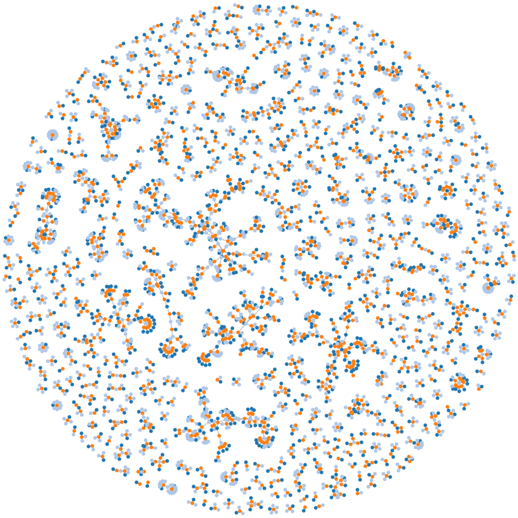
Here’s an illustration I pulled together using Python, NetworkX, and D3.js to illustrate the interconnections between abstracts that will be presented at the Vision Sciences Society 2014 annual meeting in approximately 2 weeks. Orange dots represent abstracts, Light Blue dots represent authors with at least one first authorship, and Dark Blue dots represent other authors (second through last).
VSS DNA v1

As you can see, there are large numbers of abstracts that have few shared authors.  Those abstracts that share authors often join together to create “chains” of students, advisors, and colleagues.

This is a first version, hastily pulled together, so there are a few problems.  The nodes are assigned to authors by name, which can be a problem for authors sharing the same name (which creates more connections than appropriate for a given node) or who  have inconsistent reporting of their name (for example, omitting the middle initial or alternate spelling, which can create another erroneous node). I am thinking of addressing the duplicate node issue by using a string similarity metric (e.g., Levenshtein distance) to find strings that contain similar names to combine the connections, but this could be an issue if the names are truly different people. Alternatively, I could incorporate the authors’ affiliations, but this carries similar issues (e.g., I report my affiliation as “University of Giessen” while colleagues report it as “Justus-Liebig-Universität Gießen”).

Although there are lingering issues, it is still an interesting illustration of the connections between the different abstracts being presented at VSS 2014.

Here’s the code on GitHub: visvssrelationships
Equirectangular to Stereographic Projections (Little Planets) in MATLAB

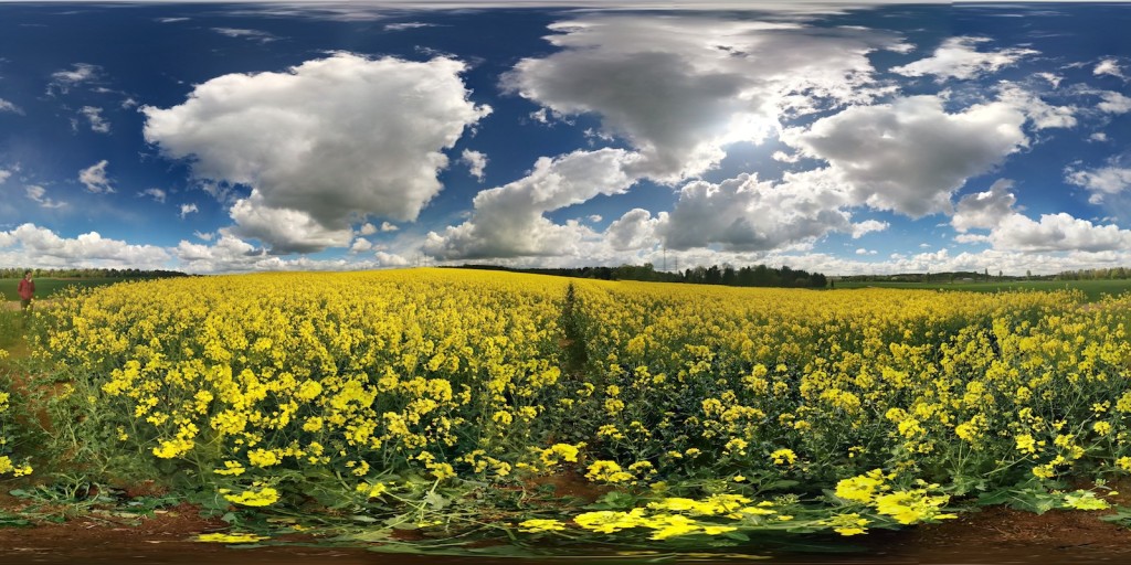
The camera included in Google’s Android mobile OS has a feature called “Photo Spheres” that allows you to take a series of photos and create a full spherical panorama. The Photo Sphere feature is included on Google Play Edition (GPE) phones –phones that incorporate Google’s version of unadulterated Android– including my Nexus 5. When you take a Photo Sphere, the camera seamlessly stitches the individual photos into an Equirectangular panorama. For example, here is a panorama I took of the rapeseed fields in central Germany:

Generated using Android's Photo Sphere function

There is a bit of distortion (see Tissot’s indicatrix), especially at the top and bottom of the image, but this is due to the problem of projecting a sphere onto a plane. On the Nexus 5 (and other GPE phones), the Gallery application includes a feature that allows you to either view the resulting Photo Spheres as spherical panoramas or to create “Little Planets”/”Tiny Planets”, which are actually Stereographic Projections of the spherical panorama. I found the effect really neat, so I wanted to see if I could recreate the projection in MATLAB.

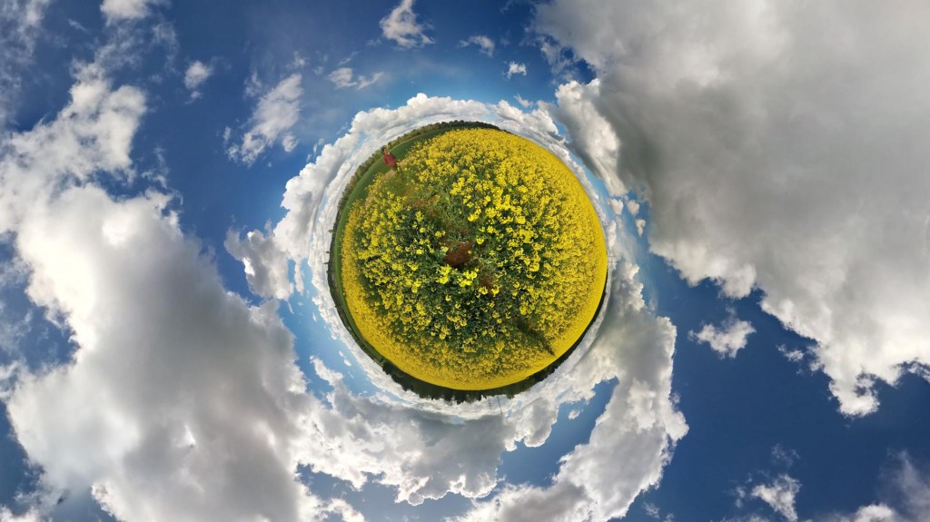
As a teaser, here’s the output for my code:

MATLAB Little Planet of German Rapeseed Field

Click through to get more information on the MATLAB implementation.
Read More

Batch Handbrake video file conversion with Python

I needed a quick little piece of code that would go recursively iterate through a folder and its subfolders and convert all of the video files to H.264, so I took advantage of the Handbrake command line interface (CLI) and Python 2.7.x to do the work for me. This code snippet is not long or elaborate, but does the job, so hopefully it will be helpful to others.

Note that the Handbrake CLI options are defined in runstr. As-is, the script will convert videos with AVI, DIVX, FLV, M4V, MKV, MOV, MPG, MPEG, and WMV extensions to H.264 MP4s with the following options:

  • “Normal” preset
  • Two-pass encoding
  • Turbo first pass, which “significantly boost[s] the speed of the first pass – with minimal effect on quality”

GoPro SuperView-like adaptive aspect ratio

For Christmas, my parents got me a fantastic gift for photographers and outdoors enthusiasts, a GoPro Hero3+ Silver Edition digital camera (Amazon). If you are not familiar with GoPros, they are small action cameras that have a very wide-angle lens and come with a water-resistant case. It’s a fantastic little camera that packs a lot of punch for such a compact package.

There are a number of GoPro editions, but the newest one are the Hero3+ Silver and Black. The Silver Edition is very similar to the GoPro Hero3+ Black Edition (Amazon), but omits a few features, including some very high-resolution video recording modes and a feature that GoPro calls “Superview”. This post talks about a way that I attempted to emulate their Superview mode in MATLAB and put together an adaptive aspect ratio function that allows one to change the image’s aspect ratio while maintaining “safe regions” with minimal distortion.

This function allowed me to resize 4:3 images and video, like this one:

To a wider aspect ratio, for example 16:9:

Click through for info on how I implemented the code.

Read More