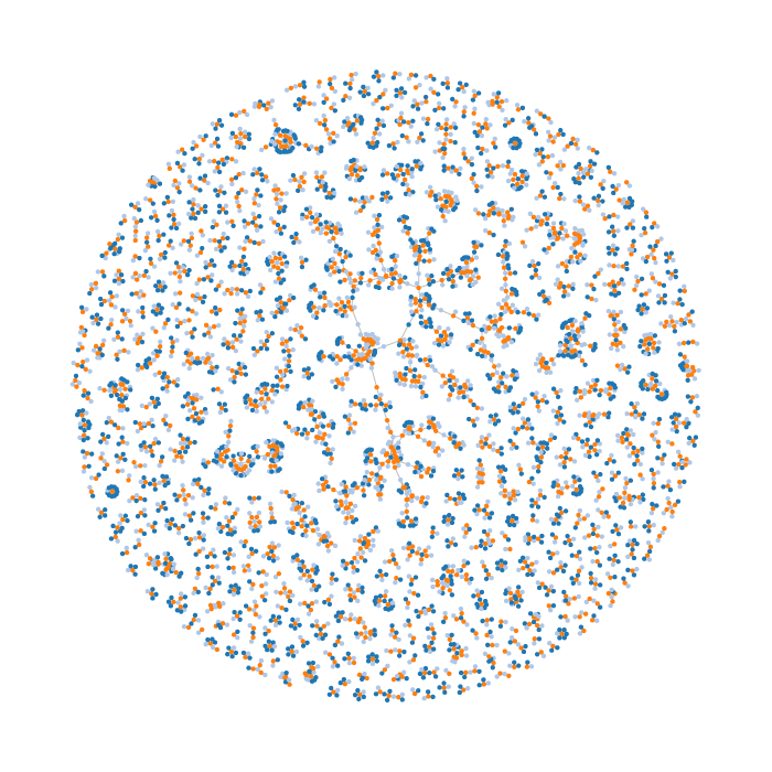
Another year, another Vision Sciences Society force-directed diagram of co-authorships (see last year’s 2014 VSS DNA). This year, we have 1419 abstracts being analyzed. The graph was generated in Python using NetworkX, with authors and abstracts as nodes and edges corresponding to authorship. Individuals who are authors on more than one abstract will have edges connecting to those abstracts.

Orange dots are abstracts, light blue dots correspond to individuals who are first authors, and dark blue dots correspond to the other author(s). This visualisation should not to be interpreted as sets of in-groups/out-groups. It ignores past/future VSS co-authorships, casual collaborations, professional collaborations outside of VSS, and likely has inaccuracies due to the way authors’ names are analysed (see after the break for more). I am intrigued by the “scholarly social network” and this visualization is just one piece of a very incomplete puzzle.
There are often inconsistencies in author names (e.g., “Steven Cholewiak” vs. “Steven A. Cholewiak” vs. “Stëvèn Chólëwìäk”), so I use the difflib SequenceMatcher to calculate ratios of the names’ similarities and names that are very similar (a ratio of 0.9 or higher) are assumed to be the same. That is admittedly a very naïve method of dealing with naming inconsistencies (e.g., is “John Smith” the same person as “John Q. Smith” or “John H. Smith”?) but I’d love to see a favourable alternative.
You can view an interactive force-directed d3.js version here. The code for the graph and force-directed diagram generation is available on GitHub here. The notebooks can also be viewed using nbviewer.ipython.org: